
The New Orleans Kitchen Paint Details (Selection Process & Product Breakdown!)

This post is in partnership with Sherwin-Williams.
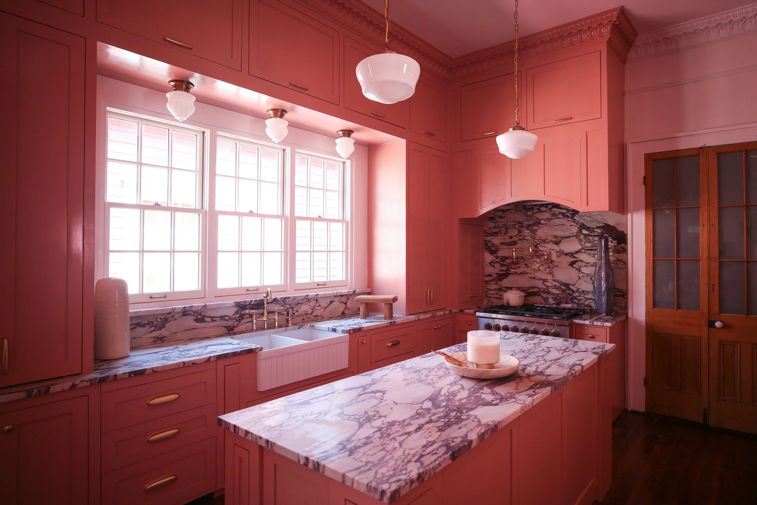
When we bought our New Orleans home we had visions of a grand kitchen with soaring cabinetry and brass fixtures and marble countertops and… a sultry and moody green paint color. Two years later and nine room redesigns done, it was finally time to make our dream kitchen come to life—our last renovation in this house. The elegant custom cabinets, the brass, the marble, we were READY. But the color didn’t feel right anymore. With the exception of our lovely study, most of the home leans warmer and brighter than a rich green color would, with a big emphasis on blush and pink tones. We thought having our kitchen follow suit with that color direction would be the perfect cherry on top to end our two years of renovating.
So our eyes meandered over to Sherwin-Williams’ beautiful selections of pinks and blushes. It’s not the first time we’ve dabbled in pink, as you may very well know! We’ve used Rosedust SW 0025 to create an Art Deco inspired family room; Mellow Coral SW 6324 to make a boisterous dining room in a previous home; Pink Shadow 0070 for a more muted midcentury modern dining area in our the last apartment we lived in before buying this house; Redend Point SW 9081 (the Sherwin Williams 2023 Color of the Year!) to make an earthy and organic laundry room at our Tennessee home; and Intimate White SW 6322 (a blush-leaning white) for the entry room of our New Orleans home.

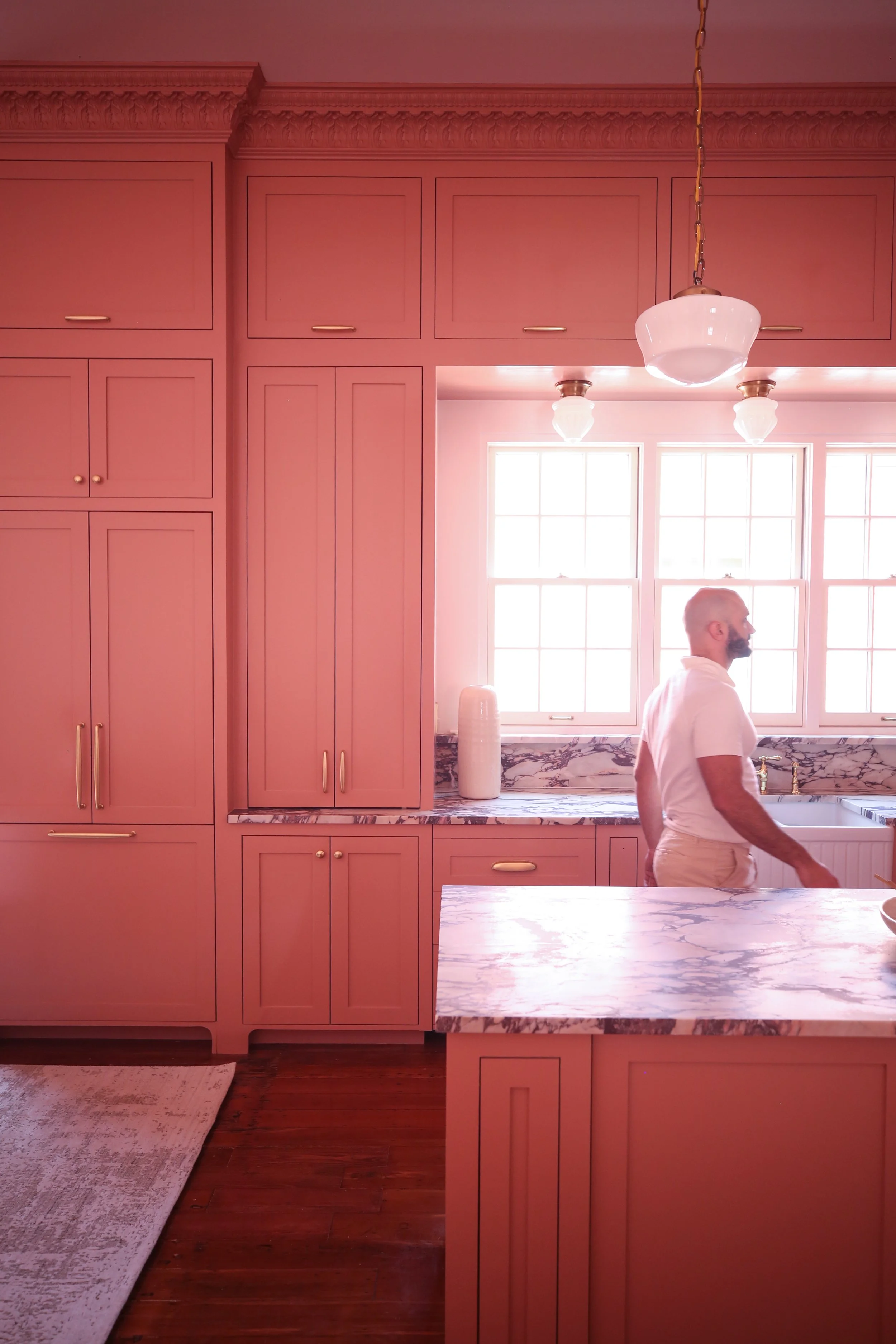

We wanted to find a pink that was inviting, but that fell just short of the warmth of a peach or coral. We wanted to basically create a modern Victorian kitchen but with an unexpected color, and we narrowed it down to Roycroft Rose SW 0034. Even the name seemed right! Roycroft Rose. Elegant and beautiful and just the right hue, making it a perfect fit for our vision. It also worked very well with Intimate White, which we ended up using on the walls, ceiling, and trim.
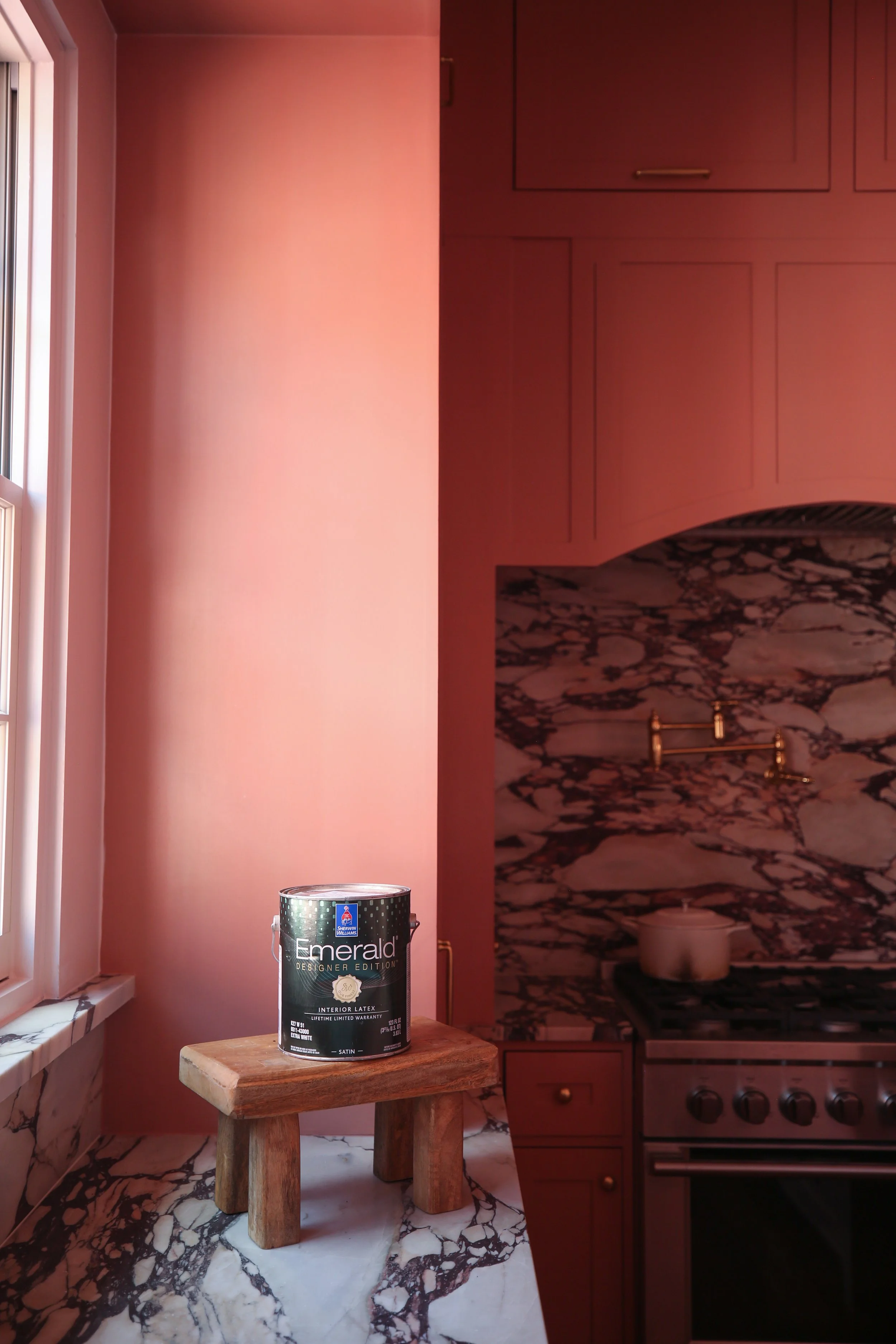
We used our favorite Sherwin-Williams paint product, Emerald® Designer Edition™, and used a gloss finish to make it even more dramatic as well as easier to clean. We had the cabinetry professionally sprayed and oh my goodness is it just one of the most beautiful paint jobs I’ve ever seen. We’ve used Emerald Designer Edition in so many of our paint projects and are always so happy with both how easy it is to work with and the quality of the finished space.


We’re so stoked with how it all came together and cannot believe this house is pretty much done—and filled with so many gorgeous Sherwin-Williams paint colors! We’ve loved using their products for the past two years and look forward to continuing to do so as we tackle the Tennessee house. If you have any questions about paint colors, Sherwin-Williams has so many resources from free Virtual Color Consultations to peel & stick samples. What do you think about this color?! Feel free to comment, email us, or DM us your comments and questions!
Best,
Beau